Thursday, September 29, 2016

Academic Shoot Reflection and Critique

1) Some challenges I encountered while trying to take pictures while following the composition rules were: trying to accomplish all the rules, and getting the right angles while taking the photos.
2) The technical aspect of photography that I found myself thinking about most was focus. For example, in my picture of the model made up of connecting pieces where I focused on the model and blurred the background.

3) If I could do the assignment again, what I'd do different now that I know some basic rules of photography is focus more on accurately depicting avoiding mergers because I didn't do that in my photos. 
4) What I'd do the same is focusing and holding the camera correctly. 
5) When I go off shooting for prompts next time, I think the easiest rule to accomplish will be rule of thirds. 
6) The rule that I think will be the hardest to capture is avoiding mergers.
7) A rule that I'm not totally clear on is framing, and I can figure out the rule by looking back at the powerpoint that we previously read. 


Nicole's Blog:

1) One thing that I like about her photographs is how she angled the camera for her balance and simplicity shots.
2) Another thing I like about her photographs is her ideas for the photos such as simplicity and leading lines. 

One thing that could be improved in the photos is not putting the subject in the center of some photos such as her avoiding mergers, balance, and framing photos. 

Monday, September 26, 2016

Aperture, Shutter Speed, and ISO- what are they?

Aperture:

Example of a Photo Taken at F2.8:


Example of a Photo Taken at F16:


1) The part of the body that we should closely relate aperture to is the pupil of your eye.
2) The smaller the Aperture the larger f-stop, the larger the Aperture the smaller f-stop.
3) Aperture impacts Depth of Field by: a smaller aperture makes the objects in the front and back of the photo clear, but a larger aperture makes the objects in the front clear but the objects in the back blurry.


Shutter Speed:

Example of a Photo Taken With a High Shutter Speed (1/8000)


Example of a Photo Taken With a Low Shutter Speed (3 seconds):


At the Beginning While the Sun was Still up and the Courtyard Still Had Reasonable Light:

a.) a booth in the middle of the yard near the Tree
High Shutter Speed
b.) a food booth outside under one of the big red awnings
Low Shutter Speed
c.) the Stars performance inside the gym
High Shutter Speed
d.) students dancing near the center of the courtyard
High Shutter Speed
e.) people streaming in from the front doors
Low Shutter Speed
f.) the basketball booth where students are shooting basketballs at a hoop
High Shutter Speed

Towards the End When There's no Sun and has Gotten Dark Enough That You Can't See From One End of the Courtyard to the Other:

a.) a booth in the middle of the yard near the Tree
Low Shutter Speed
b.) a food booth outside under one of the big red awnings
High Shutter Speed
c.) the Stars performance inside the gym
Low Shutter Speed
d.) students dancing near the center of the courtyard
High Shutter Speed
e.) people streaming in from the front doors
High Shutter Speed
f.) the basketball booth where students are shooting basketballs at a hoop
Low Shutter Speed

The three settings your camera has regarding shutter speed are: Aperture Priority, Shutter Priority, and Manual. Aperture Priority is when you set the aperture, but the camera sets the shutter speed; Shutter Priority is when you shut the shutter speed, but the camera sets the aperture; and manual is when you set the aperture and shutter speed.

ISO:

Photo Taken With ISO 200:


Photo Taken With ISO 3200:


1) The advantages of a shoot at a higher ISO for a basketball game or a night football game are: capturing the moment without a blur, or to get fast shots.
2) The suggestions that the author made about using a low ISO are: use a low ISO when there's plenty of light to get the most detail and have the best quality, or use in low light environments when you're camera is mounted on a tripod or sitting on low surfaces.
3) The suggestions that the author made about using a high ISO are: use a high ISO when there's not enough light to capture an image quickly, when shooting indoors without a flash to get rid of the blur, get fast shots, or when you think you can introduce blur to the image.


Stimulation of DSLR:

1) The aperture settings available on this camera are: an aperture of F2.8, F4, F5.6, F8, F11, F16, and F22.
2) The shutter speed settings available on this camera are: a shutter speed of 1 SEC, 1/60 SEC, and 1/4000 SEC.
3) The ISO settings available on this camera are: an ISO of 100, 200, 400, 800, 1600, 6400, 12800, and 25600.


Friday, September 23, 2016

Photo Manipulation and Ethics

1) Some main points regarding manipulation of images are: there's a thin line between portraying the truth and presenting the picture as best as possible, now "fixing" an image is easy and doesn't take too much time, photoshopping techniques have increased product sales, the ethics of manipulating photos are an issue in the industry today, it's important for photojournalists to report what they see how they see it, manipulating images has been occurring since the 1800s, and photojournalism ethics are constantly changing.
2) The philosophy of newspapers such as the New York Times and the Washington Post regarding manipulation is: no colors can be changed from the original picture, and photographers have to turn in all of their proofs as well as their final photograph in order for their photographs to be used.
3) I think some things that you can do while not crossing the line into an unethical manipulation are: cropping the image, and slightly enlarging things or making them smaller. Otherwise, I feel that the photo doesn't accurately portray what actually happened/was going on.
4)
I think this photo was the most unethical because they changed the lighting and the colors of the photograph completely. They changed the lighting to make him look more menacing which means that they're not portraying what actually happened.

I think this photo was the least unethical because they only changed something minor. They only fixed her teeth to make her look prettier.

Academic Shoot

Lines:

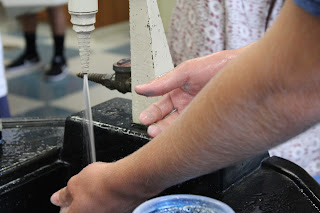
     1) The composition rule that I followed was leading lines by having the student's arms,  and the lines/shape of the sink leading to the water.                  
      2) The subject is the water because the arms are leading to the water spraying out of the sink.
3) The subject in this photo is somewhat clear if you know about leading lines.              
4) To see the subject more closely, I could've focused on the water more than I did.          


Balance:

1) The composition rule that I tried to follow was balance, however if I had centered the object or gone at a different angle, it could've represented balance more than I did.
2) The subject is the scientific model made of the connecting blocks.                                          
3) It is clear to people what my subject is.                                                                                      
4) You can see the subject clearly because I focused on the model and not the background.          


Simplicity:

1) The composition rule that I followed was simplicity because the only thing in the picture is part of the microscope and the background is simple and blurred out.
2) The subject is the objective lens.                                                                                          
   3) It is clear to people what my subject is.                                                                                  
4) You can clearly see what the subject is because the photo is focused on the subject and the background is controlled. 


Avoiding Mergers:

  1) The composition rule that I tried to follow was avoiding mergers, however I didn't really avoid mergers because there weren't any mergers to avoid. If there had been a merger, for example a pole, then if I angled the photo correctly without the pole sticking out of his head, I would've avoided mergers.
    2) The subject is the boy with the brown hair and the black shirt.                                                
      3) It is clear to people what my subject is.                                                                                      

 4)  You can clearly see what my subject is because I focused on the subject and the subject also followed the rule of thirds, and that's where your eyes naturally go.                                                         


Rule of Thirds:

1) The composition rule that I followed was rule of thirds because the girl with the blond hair is in the    upper left hand corner.                                                                 
 2) The subject is the girl in the green striped shirt with blond hair.                                                        
3) It is clear to people what my subject is.                                                                                         
4) You can clearly tell what my subject is because she is in the upper left hand corner, following rule of thirds, which is where the eye naturally falls. 


Framing:

1) The composition that I tried to follow was framing because the girls arms and the toothpicks are framing the container with egg in it.
2) The subject is the container with the egg in it.                                                                          
3) It is clear to people what my subject is.                                                                                    
4) You can clearly tell what my subject is because the arms and toothpicks are clearly framing it.    

Monday, September 19, 2016

Academic Shoot Preview

"The Story"

This photo tells the best story because you can visually see the students giving out food to the homeless and you can see how thankful the homeless people are. I think the story in this picture is that the students volunteered to help feed the homeless, and they made food to hand out.

"Action and Emotion"

This photo shows emotion by showing how the students stand together and stand for what they believe in. This photo shows action by showing the students all praying or hoping together for some reason.

"Filling the Frame"

This photo fills the frame by capturing all the emotion from the students and the results of the experiment in the photo. You can see all the bubbles, the experiment, and the students, without chopping any of those things out of the picture.


My Favorite Photo In Academics and Community Services Area:

My favorite photo is titled "Melancholy". It is a picture of a boy pouring two different liquids into one container. The background is blurred so that all you're focusing on is the boy and the different liquids. He isn't looking at the camera, he's looking at the liquids, and he is in the center of the photo. 

1) I picked this photo because I really liked how the photographer focused on the subject. I also like how they made the photo look good, even though the boy is in the center of the photo, instead of at one of the points on the rule of thirds chart. 
2) The rules of photography that are evident in this photo are: simplicity (because he focused on the subject and blurred the background), lines (because the liquids that are being poured are leading your eyes to the container with the mixed liquid, and because his fingers are pointed down, which also leads your eyes to the container with the mixed liquids), balance (because the picture is symmetrical on both sides, symmetrical balance), and avoiding mergers (because nothing is being cut out of the picture, and none of the colors are clashing).


1) I think I could take pictures like the ones I saw today in a science classroom because there could be labs going on, and there are students taking notes to take action shots of.
2) I think I'd like to take pictures in Mr.Mayfield's class.
3) As a photographer, what I will do to get amazing photos like the ones I looked at today is try and apply the different composition techniques in my photos. 


Wednesday, September 14, 2016

Post Shoot Reflection


  1. While I was trying to take pictures of my first four prompts around Bowie, I encountered the problem of not having very many ideas of where to take interesting pictures.
  2. The technical aspects of photography that I focused on while shooting was focusing and holding the camera correctly. An example of what I did to do this correctly was I focused on a flower to blur out the background. 
  3. If I could do the assignment again, what I'd do differently, now that I know some basic rules of photography would be to try and do more techniques to make my photos more interesting. For example, I would try and take a photo with lines leading toward the main interest in the photo.
  4. What I'd do the same is blur out the background for some of my photos and take more photos of flowers.
  5. I did use some rules of composition in my photos. I used rule of thirds, simplicity,and balance, and I showed that with explanations in my blog post titled "My 4 Best Photos" and below.  
  6. I would possibly be interested in shooting the same prompts again because I'm not sure if I could find more photos showing Bowie spirit. However, I would like to take more of my own ideas for photos. 
My Photos and the Rules of Composition I Used:
This photo shows rule of thirds because the flower is in the right upper corner, which makes the photo more interesting. 

This photo sort of shows symmetrical balance because the flowers on either side of the butterfly are pretty even.
This photo shows simplicity because the background is very plain so you can focus on the center of interest. 
This photo also shows rule of thirds because the flower, or center of interest, is in the upper left corner, which is one of the places where the eye naturally falls, making the picture more interesting.

Drue's Blog:

http://druesphotojournalismblog.blogspot.com/2016/09/4-favorite-pictures.html

  1.  One thing I liked about Drue's blog was how Drue made everyday things look interesting. 
  2.  Another thing I liked about Drue's blog was the angles that she took the photos at. 

  • One thing that could be improved is Drue could focus on the point of interest more to make the photo more interesting.  

Composition 9/11 Review

Simplicity:

In this photo, the background is noticeably blurred. Since the background is blurred, you can easily focus on the man with dust covering his suit. 


Rule of Thirds:

In this photo, the firefighters that are supporting the man are near the upper right corner. Since the man is in the upper right position, this picture follows rule of thirds. That makes this image more interesting than if the man was in the center of the picture. 


Lines:

In this photo, the lines on the American flags are leading toward the man's face. The lines help draw one's eyes and interest to the powerful image of the man seeking comfort in the American flag.


Balance:

In this photo, there are two people on either side of the man in the center. The two people are both wearing a mask and looking out of the picture. This photo shows symmetrical balance. 


Framing:

In this photo, the blown out windows are framing the man climbing the ladder. The frame helps make the man the center of interest. 


Avoiding Mergers:


In this photo, even though the picture is blurry, you can obviously tell that it looks like a pole is coming out of the man, in yellow shirt, head. That means that this photo isn't avoiding mergers. 


Monday, September 12, 2016

My Reaction to "The Falling Man" story

Even at the beginning of the first article, I was shocked to find out how many people had jumped out of the Twin Towers, to end their lives. I know that they would've died regardless, but jumping to one's death seems very scary. According to the article, the most controversial photo is called The Falling Man. The man is falling from the North Tower of the Twin Towers, and no one has identified the man. Since no one knows who it is, they're all denying that it was someone related to them. I don't understand why because even though I'd prefer not to learn about the death of my loved one on a magazine or online and have everyone know about it, I'd want to know how they died. I also don't understand why people think that it would be very bad for the man who jumped to be related to them. I understand that journalists are there to observe, but I don't think that I could stand by and take pictures of people falling to their deaths, and not try to do anything. In the last article, we find out that the falling man is Jonathan Briley, a 43 year old man who worked at the restaurant in the North Tower. I personally think that after waiting five years without knowing how your loved one died, that it would be very difficult to find that out on the news. 

This is the photo titled the Falling Man:

My 4 Best Photos

This photo shows rule of thirds because the flower is in the right upper corner, which makes the photo more interesting. 
This photo sort of shows symmetrical balance because the flowers on either side of the butterfly are pretty even.

This photo shows simplicity because the background is very plain so you can focus on the center of interest. 
This photo also shows rule of thirds because the flower, or center of interest, is in the upper left corner, which is one of the places where the eye naturally falls, making the picture more interesting. 

Composition 9/11

Examples of good photos shot on 9/11:


Simplicity:


This photo really shocked me. This is because I never really looked at images of how people were affected after 9/11, I only saw the images of the towers being hit or on fire. So, it amazed me to see what a surviver looked like after this emotional day. 


This photo really shows all the emotion going on during 9/11. Even if someone wasn't hurt personally, all the destruction and death of other people really affected Americans. The person in the picture is crying and is definitely grateful to still be alive. 


Rule of Thirds:


This photo shows the heroes of America during 9/11. It made me feel the pride of America and why we should never forget 9/11. It was a terrible event, but it brought out the heroes and the best in people. 


Lines:


I'm not quite sure which building this is, but every time I look at a picture of the destruction from 9/11, it makes me feel amazed. I'm not amazed in a good way, but amazed in the way that I can't believe someone would do this and be capable of doing this to America and to everyone living in America. 

I feel shocked when I look at this photo. That is because I can't believe what's really happening. They had to chose between being burnt in the fire, or jumping out of the building. Also, I'm aware that journalists are there to observe, but it still amazes me that someone can stand by and take a photo instead of trying to help save someone's life. 


Balance:


This is the lobby of the World Financial Center after the Twin Towers collapsed. This photo just makes me feel sad, looking at all the destruction that happened during the day, even though this picture doesn't capture the worst of it.  


Framing:


This picture is of a firefighter climbing through the windows of the World Financial Center. It makes me feel proud and thankful for all of the people that risked their lives to help save and rescue people during 9/11. 


Avoiding Merges:


This photo is of the south tower being struck and it makes me feel sad about all the deaths and destruction that went on during 9/11. 

Friday, September 9, 2016

The Camera

Some Interesting Information about the Camera

The Camera:
1) The camera obscura effect is an optical effect discovered by Greek and Chinese philosophers. It is achieved by creating a small hole in the wall in a completely dark room, and the outside scene is projected upside down on the wall. This is because the hole acted like the lens of the camera, that focuses and projects light onto the wall.
2) The invention in the 17th Century that helped man get one step closer to inventing the modern camera was the glass lens.
3) The parts of the first modern camera that was invented by Niepce are a glass lens, a dark box, and a film.
4) Modern digital cameras have a lens where light passes through into the camera, or box in the case of Niepce. That is what modern digital cameras have in common with Niepce's camera.
5) Digital cameras use an electric sensor called a CCD to capture an image.

Camera Modes:
1) The difference between the Auto Mode and the Program Mode is that Auto Mode completely controls flash and exposure, but in the Program Mode, you can control flash and a few other camera settings.
2) The Portrait Mode is used to blend out the background. It works by using the fastest available lens setting (aperture).
3) The Sports Mode is used to freeze motion. It works by using the highest shutter speed possible.

The Half Press: 
1) You should do a half press on the trigger  button because that allows faster camera response time, more control over focus, and it encourages better composition.

Controlling Flash:
1) The symbol below (Disabled Flash) means that there is no flash. You would use this when you want the mood of the photograph to be more dramatic.
2) The symbol to the right (Auto-Flash) means that auto-flash is determined by default. The camera will automatically fire if it thinks it needs more light.


Introduction to Exposure:
1) If there's too much light, then your photo will look washed out. 
2) If there's not enough light, then your photo will look too dark. 

The Universal Stop:
1) A "stop" a term used to represent a relative change in the brightness of the light. 
2) If there are two suns, rather than one, the planet is 1 stop brighter. 
3) If there are four suns, the planet is 2 stops brighter. 

Shutter and Aperture:
1) Longer shutter speed has the effect of more light. 
2) Shorter shutter speed has the effect of less light. 
3) The aperture controls the amount of light that reaches the film. 
4) When adjusting the aperture, you can increase the amount of light by setting the F-stops numbers to lower numbers, which creates larger openings, which in turn increases the amount of light. 

Wednesday, September 7, 2016

3 Modern Day Photographers

  1. Eleni Mahera- This photograph doesn't have a name, as far as I can tell, but I like it because it captures so much emotion within one picture. 
  2. Mark Hamblin- The name of this photograph is "Grand Tetons" and I like it because it is a landscape photography of a pretty scene, and nature is what I like to take pictures of. 
  3. Jess Findlay- The name of this photo is "Second Beach Sunset" and I like it because it captures an awesome scene in a landscape photo. 

Tuesday, September 6, 2016

Great Black and White Photographers


  1.  Lee Friedlander- this picture is called "New York" and I like it because it shows action and candid shots of what's actually going on.  
  2. New York City, 1963, gelatin-silver print

  3.  Brassai- this picture is called "House of Illusion" and I like it because the picture looks very mysterious. 
  4. Image result for Brassai- this picture is called "House of Illusion
  5. Eugene Atget- this picture is called "Jouere d'orgue" and I like it because the picture is candid and captures what's going on in the moment. 


Image result for Eugene Atget- this picture is called "Joueur d'orgue"